Vestor
fashion e-commerce store
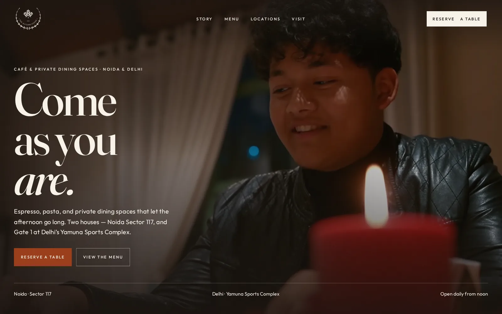
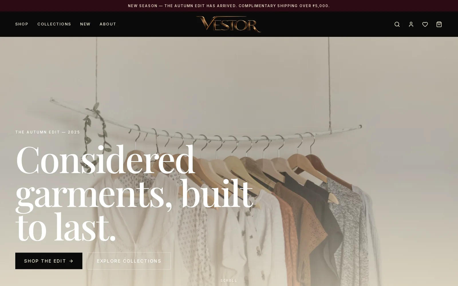
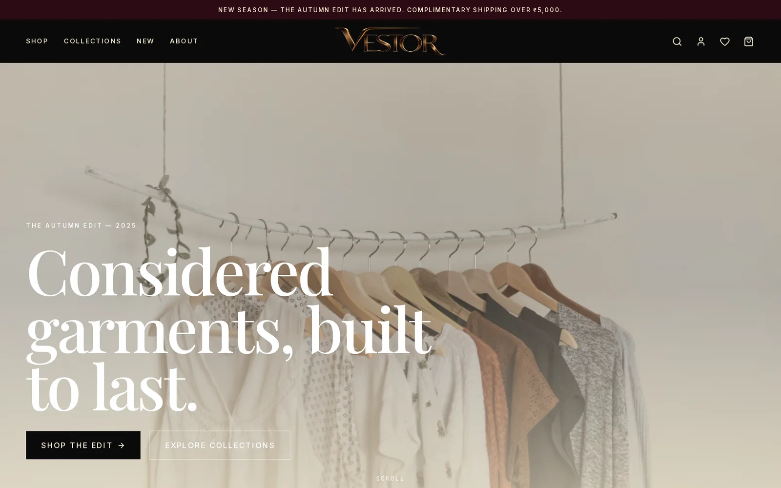
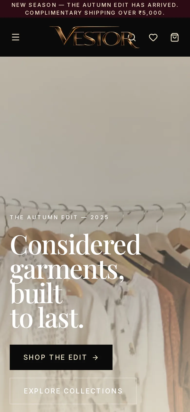
A minimal fashion store for a premium clothing label, with seasonal collections, new arrivals, quick view and sale pricing, designed around large editorial imagery.
- E-commerce
- Fashion
- Web design
Vestor makes considered garments for the modern wardrobe. The store needed to feel like a fashion magazine while staying quick to shop.
What we built
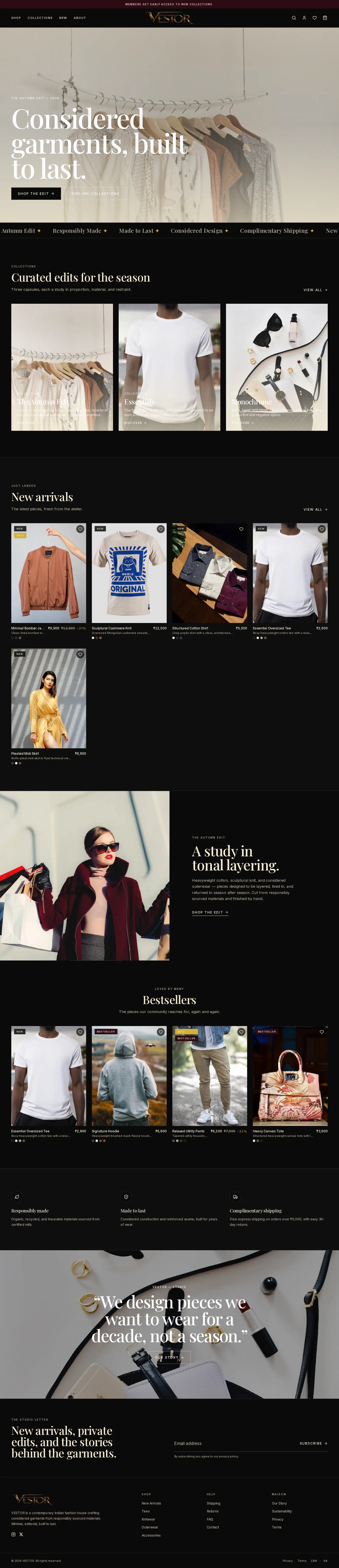
- Collection pages for capsules like The Autumn Edit, Essentials and Monochrome.
- New arrivals grid with quick view, new and sale badges and discount pricing.
- Members early-access banner and complimentary shipping messaging.
- Editorial layout built around large imagery and clean typography.
- Quick view so shoppers assess a product without leaving the collection.
- Cart and checkout integrated with the brand's payment flow.
- Mobile-first so the store looks as good on a phone as on a desktop.
The problem
A clothing label that wants magazine photography still has to be shoppable: collections, new arrivals, sale badges, without a cluttered mega-menu. Most fashion templates push products into identical grids — Vestor needed the capsule story to come first.
Approach
We designed from the editorial outward. Capsules (Autumn Edit, Essentials, Monochrome) sit in full-bleed sections that feel like lookbook pages. The new-arrivals grid surfaces sale and new badges without interrupting the visual rhythm. Shipping and members messaging stay in slim banners at the top so the imagery is never buried.
Outcome
Launched within four weeks from brief to live. The store runs on a custom front end with no template overhead — page loads stay fast even with large campaign imagery.
Stack
Custom front end. Live: vestorr.in.
Need something similar?
We build websites and web apps for businesses worldwide. Book a free call and we'll scope it with you.
Screens
Let's build what's next.
Tell us about your idea or the problem slowing your team down. We'll suggest the simplest way to solve it, with a clear quote.